June 25, 2026
We're Very Well Read, It's Well Known: 400+ Artists Paint Their Favorite Books
Mural Conservancy of Los Angeles
May 23 - September 6, 2026
We're Very Well Read, It's Well Known
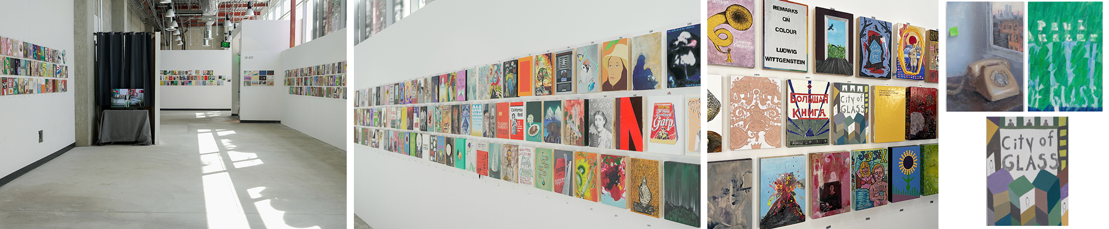
Matt Gleason put together an expansive exhibition with 474 artists called We're Very Well Read, It's Well Known: 400+ Artists Paint Their Favorite Books. Each submitted a 6 x 9 inch panel covered with a reference — be it direct or obtuse — to their favorite book. The artists were told that the works would be installed salon style but other than that, the directive was open ended. Not everyone made paintings. Not everyone made vertical works. Some had dimensionality — in that they were more sculptural, not flat. The results are astonishing. Not just the quality of the paintings (or drawings or collages or photographs) but the intent, and the purposeful choices the artists made.
Full disclosure: I participated in this exhibition with a painting based on Paul Auster's City of Glass from 1985. Why City of Glass? Paul Auster was one of the first authors I diligently followed, reading his new novels, poetry and essays as soon as they were published, buying first editions in hardcover to the point where now they now fill multiple shelves. The cover of City of Glass (at least my edition) pictures New York aglow, but also silhouetted. The book unfolds like a labyrinth. Without much deliberation, this was my choice and my painting is an abstracted city inline with the paintings I have been making for the last several years. I was pleasantly surprised to find two other very different interpretations of the same book in the exhibition, one by Kenny Harris and the other by Joshua Aster. Around the time I sent the artwork, I purchased a copy of Ghost Stories, a memoir by Siri Hustvedt, Auster's window (he died of lung cancer in 2024). I was fully engrossed with his world and work which made the making of the painting more personal and significant. I wondered about the other artists' stories in relation to their choices.
With so many artists, the opening was jam packed. The images covered every wall, stacked two or three high. Upon arrival, one had to consult the robust website just to find their item number and locate their work from the multitudes. In the process, there were hellos and hugs, as well as marveling at other artist's creations. What also has been extra special is seeing the announcement coupled with so many artist's paintings on social media. Everyone was delighted to participate and share their work, as well as document their experience.
History books, children's books, novels, as well as theory, and art books appear. Some artists included the author and title, others painted or illustrated their impressions ranging from portraits to landscapes to pure abstractions. Buzz Spector contributed a painting where a black line depicts a blank book against a white ground. He calls it Any Book, by Any Author. Lawrence Gipe realistically reproduces a fragment of the cover of Guy Debord's Society of the Spectacle. Sant Khalsa collages the ring of a tree in her interpretation of Pete Wohlleben's, The Hidden Life of Trees. Sunset Strip by Ed Ruscha is recreated by David Horri. Pride and Prejudice by Jane Austin is transformed into a Modrian-esque abstraction by Frederika Beesemyer Roeder.
What is so extraordinary about the concept and the presentation is not just the fact that artists read, as clearly they do. What artists read is as diverse as what they paint. Collectively, as the exhibition title states, "We're very well read" and "we're making it well known."
Click here for Various on its own page.