January 31, 2019
Meg Cranston
Hue Saturation Value: The Archer Paintings
Meliksetian Briggs
January 12 - March 2, 2019
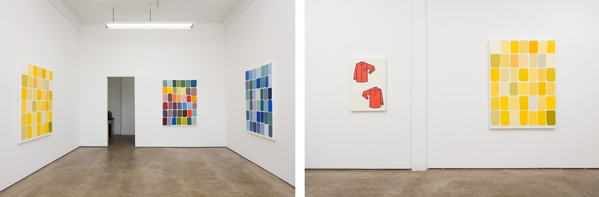
installation view
Meg Cranston's The Archer Paintings are a suite of works originally made for an exhibition at the Archer School for Girls, developed in collaboration with the students who suggested names for the color swatches Cranston created and also chose their favorite colors. Cranston has an interest in color theory in addition to a curiosity about color forecasting and the Pantone Corporation‘s role in creating a market (and a value) for specific colors each year.
In Hue Saturation Value there are five paintings on view: one in tones of blue, one red and one yellow. A fourth painting represents the full spectrum of colors and the fifth entitled, Mr Moseby’s Salmon Not Pink Shirt, 2019, depicts a sketchy rendition of the front and back sides of a man’s dress shirt. Its color — a reddish orange— was voted one of the top colors by the Archer students and coincidently is close in tone to Pantone’s 2019 color of the year—living coral.
Cranston’s project pays homage to Josef Alber‘s Interaction of Colors as well as to the myriad artists who have painted grids. Yet, while she draws from historical precedents, Cranston’s projects are always uniquely her own and have a thought-out conceptual framework. At Archer, she engaged with students aged 10-18, discussing the “value” of color, the idea of “saturating” a market as well as instructing them in the mechanics of painting— how to vary colors through the adding of black and white to the three primary colors (red, yellow and blue).
Cranston also introduced the students to the Pantone Matching System and the company’s color naming conventions while simultaneously asking them to think of their own names for the different colors, acknowledging that both the right tonalities and the right name are the necessary ingredients for a winner.
While there are infinite colors and color combinations, Cranston’s paintings feature an unnamed, seemingly random, selection. Her works are hand-painted grids, seven rows and six columns of round-edged rectangles against a white ground. Hue Saturation Value (Yellow), 2018, is a 60 x 45 inch oil painting on canvas. The range of color transitions from a mustardy yellow to an overcooked pea green, and includes deep oranges as well as light grays.
To achieve these variations, Cranston adjusted the hue, saturation and value of the color following principals taught in color theory. She created a blue as well as a red painting, in addition to one where she drew from the full spectrum. The resulting pieces call to mind conceptual and minimalist variations as well as the paintings of Ellsworth Kelly. While Cranston’s paintings are formally composed and satisfying to view, they resonate on a deeper level when seen in the context of the project and as an exploration of the concept and appeal of color.
Note: This review was first published in Art Now LA, January 23, 2019.
Hue Saturation Value: The Archer Paintings
Meliksetian Briggs
January 12 - March 2, 2019
installation view
Meg Cranston's The Archer Paintings are a suite of works originally made for an exhibition at the Archer School for Girls, developed in collaboration with the students who suggested names for the color swatches Cranston created and also chose their favorite colors. Cranston has an interest in color theory in addition to a curiosity about color forecasting and the Pantone Corporation‘s role in creating a market (and a value) for specific colors each year.
In Hue Saturation Value there are five paintings on view: one in tones of blue, one red and one yellow. A fourth painting represents the full spectrum of colors and the fifth entitled, Mr Moseby’s Salmon Not Pink Shirt, 2019, depicts a sketchy rendition of the front and back sides of a man’s dress shirt. Its color — a reddish orange— was voted one of the top colors by the Archer students and coincidently is close in tone to Pantone’s 2019 color of the year—living coral.
Cranston’s project pays homage to Josef Alber‘s Interaction of Colors as well as to the myriad artists who have painted grids. Yet, while she draws from historical precedents, Cranston’s projects are always uniquely her own and have a thought-out conceptual framework. At Archer, she engaged with students aged 10-18, discussing the “value” of color, the idea of “saturating” a market as well as instructing them in the mechanics of painting— how to vary colors through the adding of black and white to the three primary colors (red, yellow and blue).
Cranston also introduced the students to the Pantone Matching System and the company’s color naming conventions while simultaneously asking them to think of their own names for the different colors, acknowledging that both the right tonalities and the right name are the necessary ingredients for a winner.
While there are infinite colors and color combinations, Cranston’s paintings feature an unnamed, seemingly random, selection. Her works are hand-painted grids, seven rows and six columns of round-edged rectangles against a white ground. Hue Saturation Value (Yellow), 2018, is a 60 x 45 inch oil painting on canvas. The range of color transitions from a mustardy yellow to an overcooked pea green, and includes deep oranges as well as light grays.
To achieve these variations, Cranston adjusted the hue, saturation and value of the color following principals taught in color theory. She created a blue as well as a red painting, in addition to one where she drew from the full spectrum. The resulting pieces call to mind conceptual and minimalist variations as well as the paintings of Ellsworth Kelly. While Cranston’s paintings are formally composed and satisfying to view, they resonate on a deeper level when seen in the context of the project and as an exploration of the concept and appeal of color.
Note: This review was first published in Art Now LA, January 23, 2019.